Your portfolio tracker just got a major upgrade. The new Portfolio Value page gives you the deepest view yet into how your investments are allocated — by type, ticker, country, and sector.
Today we're launching Portfolio Value — a dedicated page packed with interactive charts that break down your portfolio from every angle.
What's new
Portfolio Evolution with chart-type toggle
Switch between a classic line chart and a stacked bar chart to see your invested value vs. capital gain over time. Choose your preferred time range (12 months to All Time) and filter by asset type.Consolidation breakdown
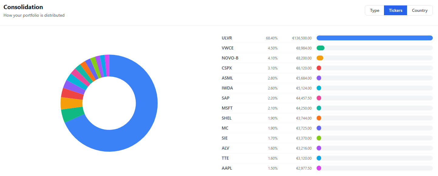
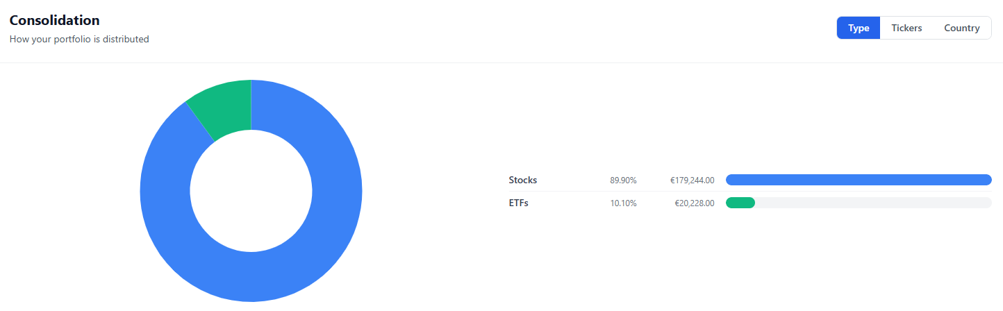
A full-width doughnut chart that shows your portfolio distribution. Free users see the Asset Type view (Stocks / ETFs / Bonds). Premium subscribers unlock two additional views:- Tickers — every individual holding with its percentage and euro value
- Country Exposure — see which countries your capital is concentrated in
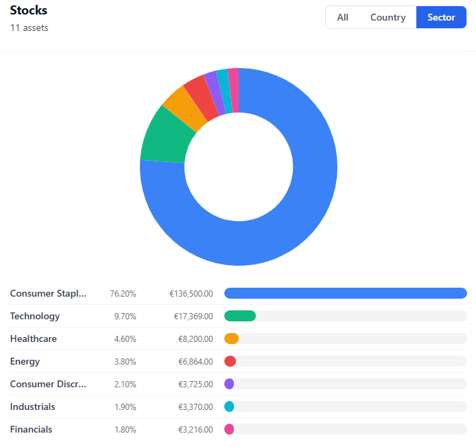
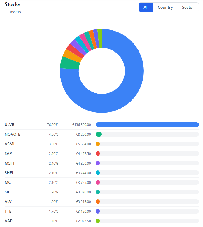
Stocks deep-dive
A dedicated doughnut chart just for your stock holdings. The free "All" view shows each ticker. Premium unlocks:- By Country — are you overexposed to a single market?
- By Sector — Technology, Healthcare, Financials, and more
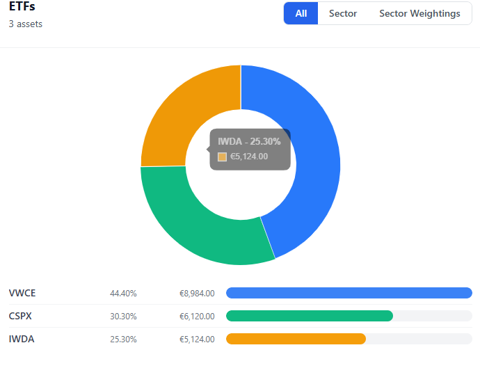
ETFs deep-dive
Same concept for your ETF positions. Premium adds:- By Sector — which industries your ETFs are focused on
- Sector Weightings — the actual underlying sector composition pulled from the fund data, weighted by your position size
Richer tooltips & legends
Every chart now shows a detailed tooltip (label, percentage, euro value) and a table-style legend with proportional color bars — inspired by the best professional portfolio tools.Sector Allocation on the dashboard
The main Overview dashboard now includes a Sector Allocation doughnut chart. Premium users see the full breakdown; free users see a tantalizing blurred preview.Friendly empty states
No more blank white charts. If you don't have ETFs yet (or any other category), you'll see a clear message explaining what to do.
Built for clarity
We believe your portfolio data should be instantly understandable. That's why every chart follows the same interaction pattern: click a filter tab, see the breakdown update in real time. No page reloads, no waiting.
Premium-only filters show a blurred preview behind a lock icon — you can see what the feature looks like before upgrading.
Ready to see your full picture?
The Portfolio Value page is available now for all users. Free accounts get the essential views; Premium unlocks the full depth — country exposure, sector breakdowns, ETF weightings, and more.
Comments 0
No comments yet. Be the first to comment!
Leave a comment