The Holdings Performance chart on the Growth page gives you a clear ranking of how each individual stock, ETF, or crypto in your portfolio has performed. It’s a horizontal bar chart, sorted from best to worst return percentage.
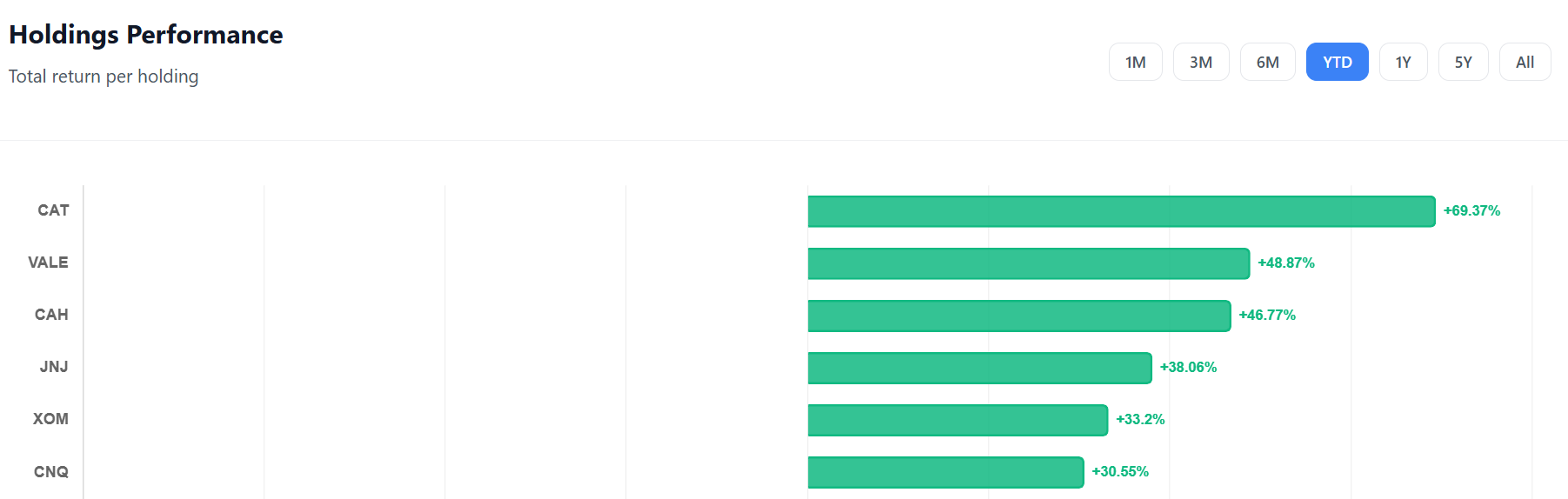
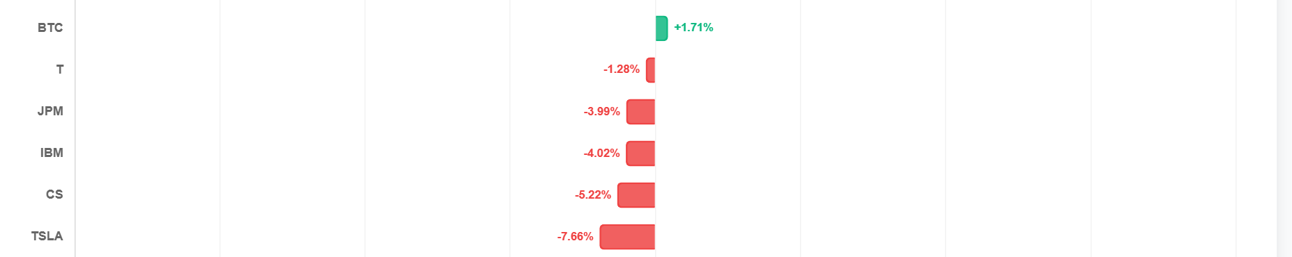
What Each Bar Shows
- Green bars — holdings with a positive total return
- Red bars — holdings with a negative total return
- Percentage label at the end of each bar — the exact return %
Hover over any bar to see the full tooltip:
- Total profit — return % and euro amount
- Capital gain — the price appreciation
- Fees paid — total trading fees for that holding
Period Filters
Filter the performance by time period to see how your holdings performed recently vs all-time:
| Filter | Free | Premium |
|---|---|---|
| 1M / 3M / 6M / YTD | ✓ | ✓ |
| 1Y / 5Y / All | — | ✓ |
How the “All” Period Works
When you select “All”, the data comes directly from your consolidated holdings — the total return since you first bought each position. This is instant and always accurate.
For shorter periods (1M, 3M, etc.), we compare portfolio performance snapshots at the start and end of the period to calculate the return for each holding during that window.
How to Use It
Identify winners and losers: Your top performers validate your thesis. Your bottom performers might need a closer look — is the dip temporary or fundamental?
Fee awareness: Hover over holdings to see total fees. High fees on small positions can quietly eat into your returns.
Rebalancing signals: If one holding dominates with 100%+ returns while others lag, your portfolio may have become over-concentrated. Consider whether it’s time to rebalance.
Period comparison: Switch between YTD and All-Time. A stock that’s up 80% all-time but down 5% YTD might be in a temporary dip — or losing momentum.
Comments 0
No comments yet. Be the first to comment!
Leave a comment