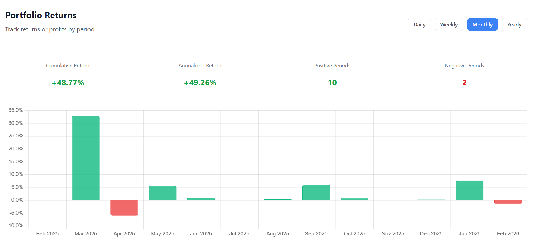
The Portfolio Returns chart on the Growth page breaks your overall return into individual time periods, displayed as a bar chart. Green bars represent positive returns; red bars represent losses.
How to read this chart
Each bar represents one period (a day, a week, a month, or a year). The height of the bar shows the return percentage for that period. Hover over any bar to see both the return percentage and the absolute euro profit.
Below the chart, you’ll find four summary stats:
- Cumulative Return — your total return over the full displayed range
- Annualized Return — what your cumulative return would look like if normalized to a one-year period
- Positive Periods — how many periods had a gain
- Negative Periods — how many periods had a loss
Granularity Options
| View | Free | Premium | Best For |
|---|---|---|---|
| Daily | ✓ | ✓ | Spotting volatile days |
| Weekly | ✓ | ✓ | Short-term trend analysis |
| Monthly | — | ✓ | Tracking month-over-month growth |
| Yearly | — | ✓ | Long-term performance summary |
How to Use It
Consistency check: If most of your bars are green, your strategy is working. A mix of green and red is normal — what matters is that the green bars are taller on average.
Spotting patterns: Do you tend to lose money in certain months? The monthly view can reveal seasonal patterns in your portfolio.
Comparing periods: Switch between Daily and Weekly to see if your short-term volatility smooths out over longer periods — a sign of a resilient portfolio.
Calculation Method
For each period, the return is calculated as:
Return % = (End Value − Start Value − Net Cash Flow) / Start Value × 100
Net cash flow is subtracted so that adding money to your portfolio doesn’t artificially inflate your return.

Comments 0
No comments yet. Be the first to comment!
Leave a comment